
Sole Product Designer
4 Weeks (September 2024)
HealthTech
VaxNow is a digital health platform designed to centralize vaccination and medication records for families. The idea was born from a simple observation. Many parents struggle to keep track of vaccination schedules, medication routines, and reliable health information. Paper cards get lost, hospitals rarely synchronize data, and reminders are inconsistent. VaxNow provides a structured system that brings record keeping, reminders, consultations, and hospital guidance into one unified experience.The platform was created to support parents, especially in regions where vaccination adherence is low and medical documentation is fragmented. With VaxNow, families gain visibility into their health data, healthcare providers gain accuracy, and children receive timely care.
The primary goal of VaxNow is to improve medical record accessibility while increasing vaccination adherence across Africa. The product aims to bridge the gap between parents, healthcare providers, and digital documentation. It seeks to reduce missed vaccinations, reduce misdiagnosis caused by poor documentation, and promote continuity of care across hospitals. By offering digital records, medication tracking, real time reminders, and quick access to verified medical professionals, VaxNow positions itself as a trusted, long term healthcare companion for families.
The long term strategy is built around accessibility, scalability, and integration. VaxNow aims to establish itself as the go to platform for vaccination and medication logging. Phase one focuses on Nigerian urban and semi urban cities. Phase two will involve strategic integration with government immunization programs. Phase three expands into private hospitals and schools. Our roadmap prioritizes a strong ecosystem approach. The more stakeholders adopt the system, the more valuable the platform becomes for everyone involved. families.
The core goal was to design a simple, intuitive, and reliable digital platform where parents can track vaccinations, record medications, connect with doctors, and locate hospitals. The solution needed to reduce cognitive load, accommodate low digital literacy, and work even in low internet environments.The project also required designing a scalable database structure that hospitals can plug into. This allows medical records to remain accessible regardless of where the patient visits.families.


I compared existing child health apps, generic reminder apps, hospital EMR systems, and vaccination websites. I found that while some tools offered reminders and others offered documentation, few offered both in a unified experience. Even fewer catered to African parents or addressed local vaccination schedules. In regards to competition, it was clear parents wanted simplicity, reliability, and localized information, while hospitals wanted accuracy, digitization, and easy access to patient records.
My role focused on designing a website that clearly communicates the value of the VaxNow mobile app while guiding users toward download, subscription, or learning more about the service. Interaction design was centred on clarity, flow, and reducing cognitive effort for parents who may already be overwhelmed by childcare responsibilities. To achieve this, I crafted a layout that highlights core features through simple visual hierarchies. I used clean typography, friendly illustrations, and intuitive navigation to make the website feel approachable. Each section of the site moves the user from awareness to understanding to action.Accessibility was integrated from the start. High contrast colors were chosen to support low vision users. Buttons were designed with large tap areas for mobile browsing. Text was broken into digestible segments to support users with limited attention or lower literacy levels. Alt text was added to all images and infographics. The website also supports responsive viewing to ensure parents browsing on low end devices have a smooth experience. The goal was to ensure every visitor can understand the purpose of the platform, trust its reliability, and take the next step with confidence.
During ideation, I explored multiple website structures, hero concepts, and storytelling approaches. Several layout directions were tested, including a product first layout, a parent centric emotional narrative, and a data driven educational format.After reviewing user research, I prioritised a storyline that blends trust, clarity, and emotional reassurance. Parents needed to feel that VaxNow is not just another app but a reliable companion. The website therefore emphasizes real problems, clear benefits, and visual walkthroughs of how the app simplifies their daily routines.
Designing for an audience with varied digital literacy meant simplifying every interaction on the website. One challenge was presenting medical information without making the site feel heavy or intimidating. I solved this by breaking complex features into small, friendly sections supported by icons and short explanatory text. Balancing informational depth with visual charm required thoughtful design decisions. Every section was refined repeatedly to maintain clarity, warmth, and trust.
The research directly informed the website's structure and tone, addressing parental fears about losing paper vaccination cards by creating a clear visual guide to the digital vaccination card feature and prominently showcasing the automatic reminder system. Concerns about self-medication were resolved by adding a section explaining the medication tracker's dosage routine guidance, while user demand for trusted support led to a dedicated explanation of the DocChatfeature, including pricing. The website successfully became a bridge, also integrating a separate page focused on the hospital partnership vision to meet provider requests for a shared record system.
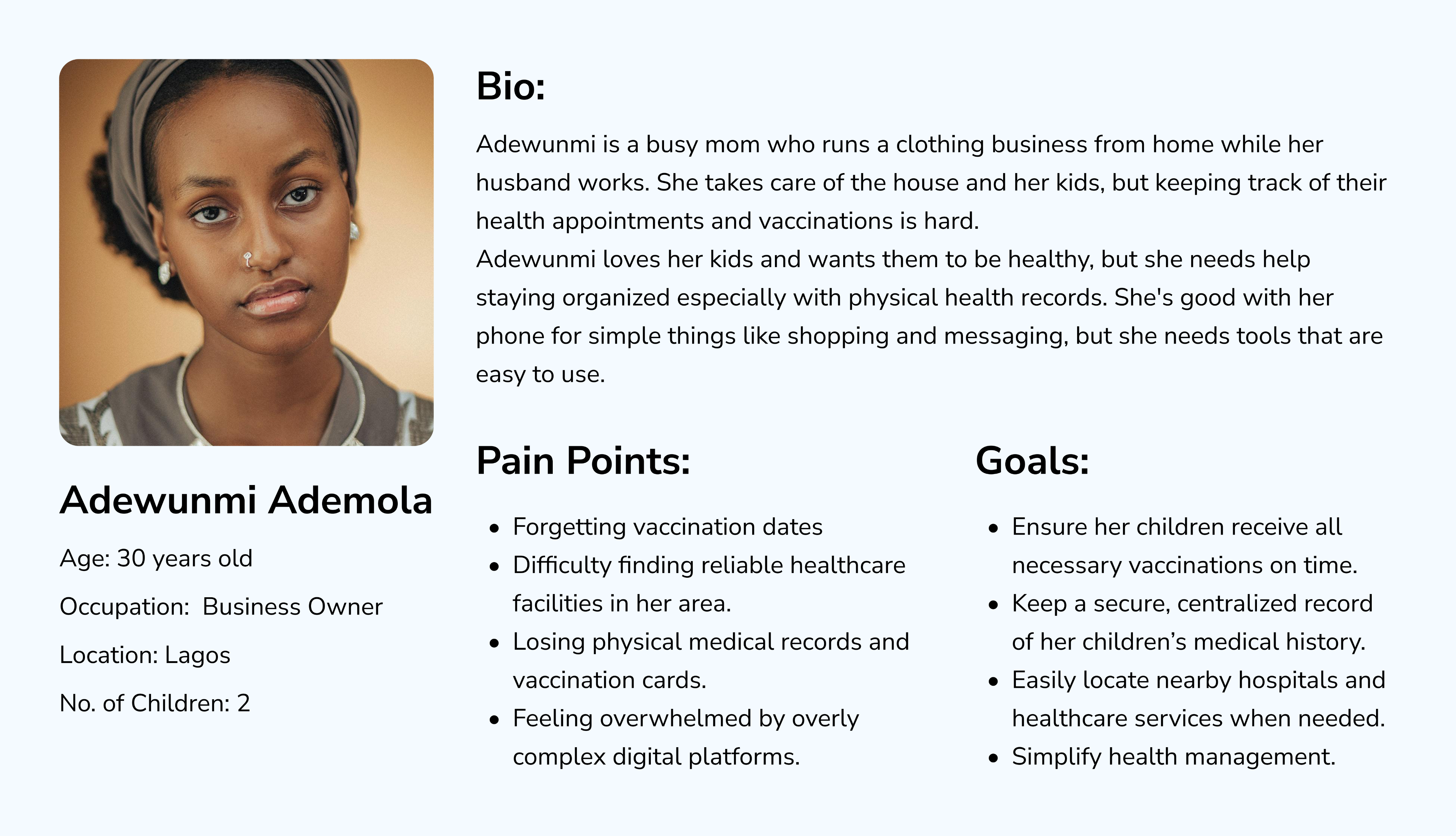
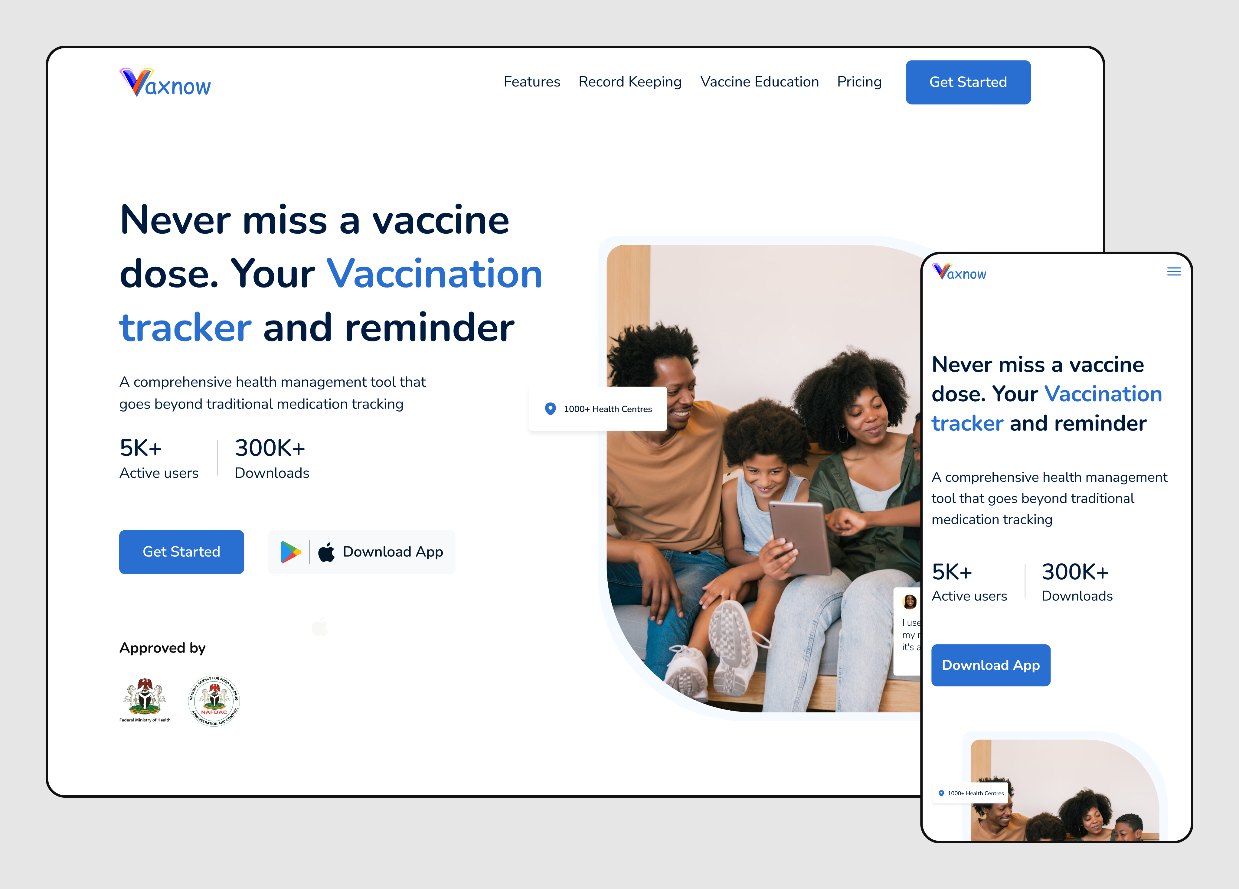
Clear Value Proposition: The headline immediately states the core benefit: "Never miss a vaccine" with a "vaccine tracker and reminder" focus. Problem-Solution Framing: The design uses contrasting sections to highlight the pain point ("Tired of losing track of your vaccinations?") and introduce the solution ("A centralized platform..."). 
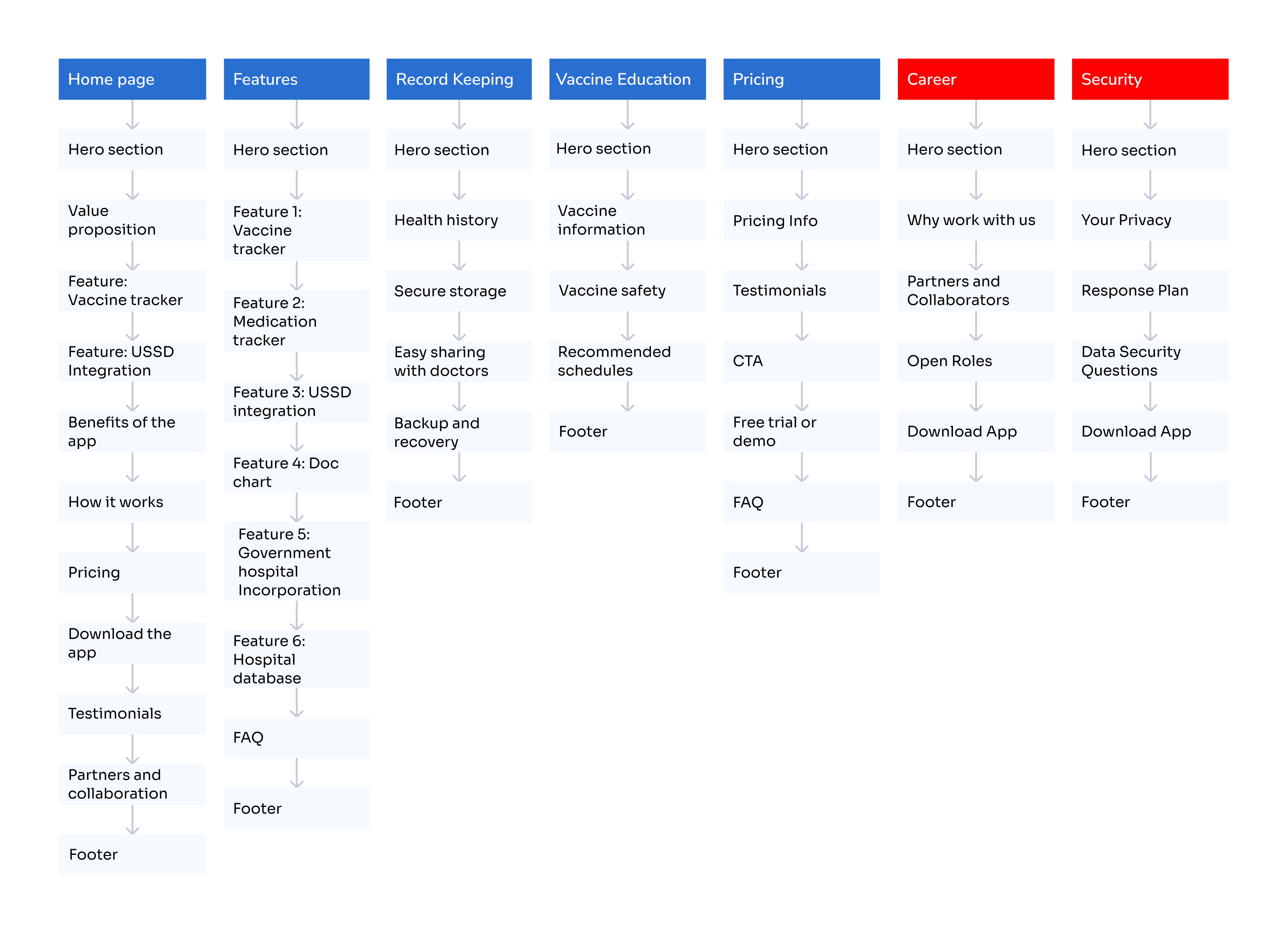
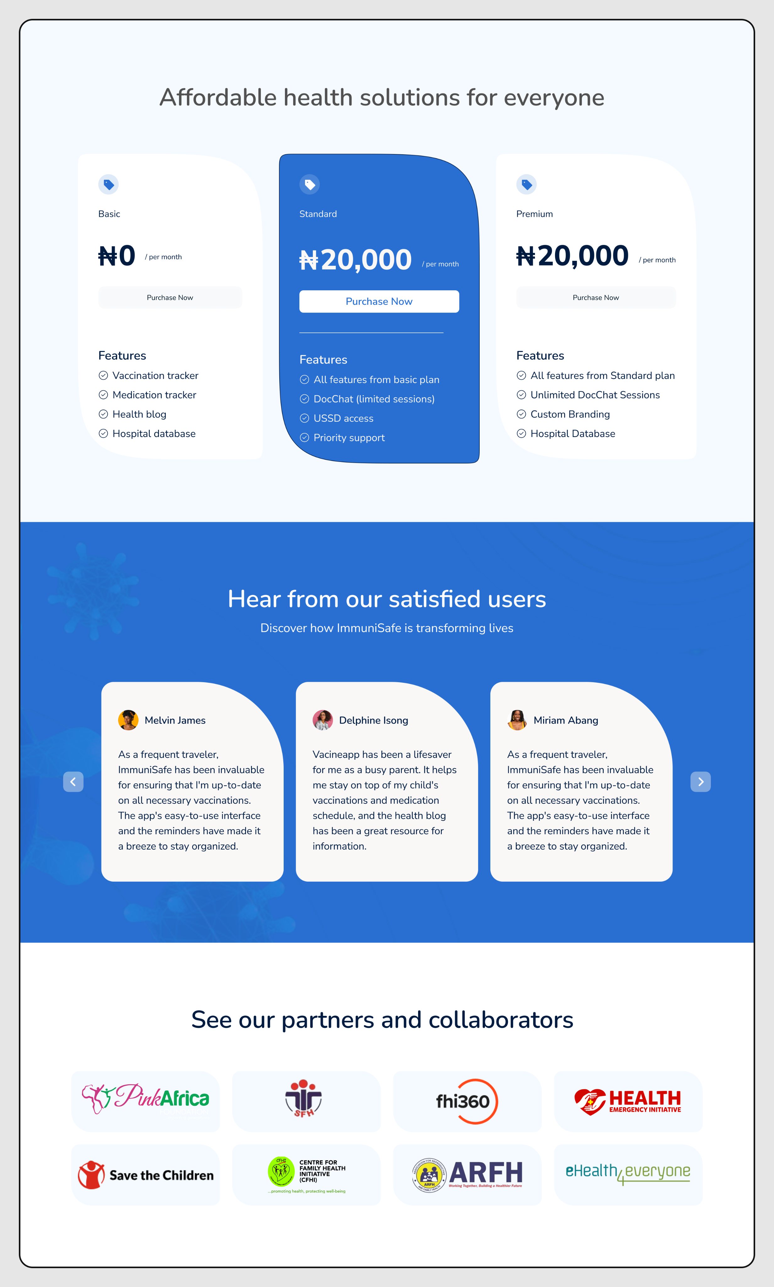
Affordable Pricing: The page clearly displays three distinct pricing tiers for different user needs. Trust & Credibility: A dedicated section showcases logos of "partners and collaborators" to build trust. 
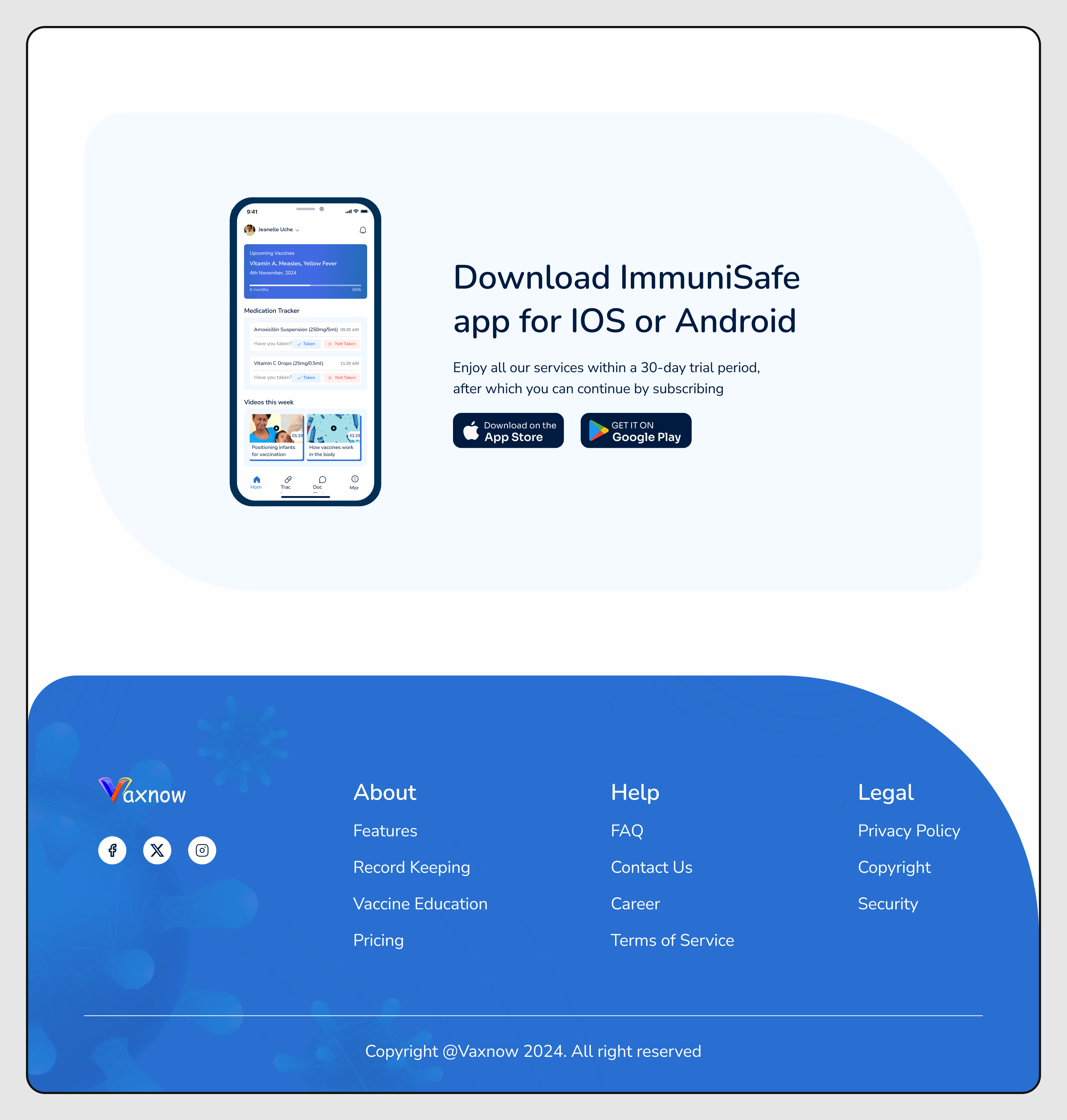
Platform Availability: The bottom section provides clear links/badges to download the app on both the Apple App Store and Google Play Store.


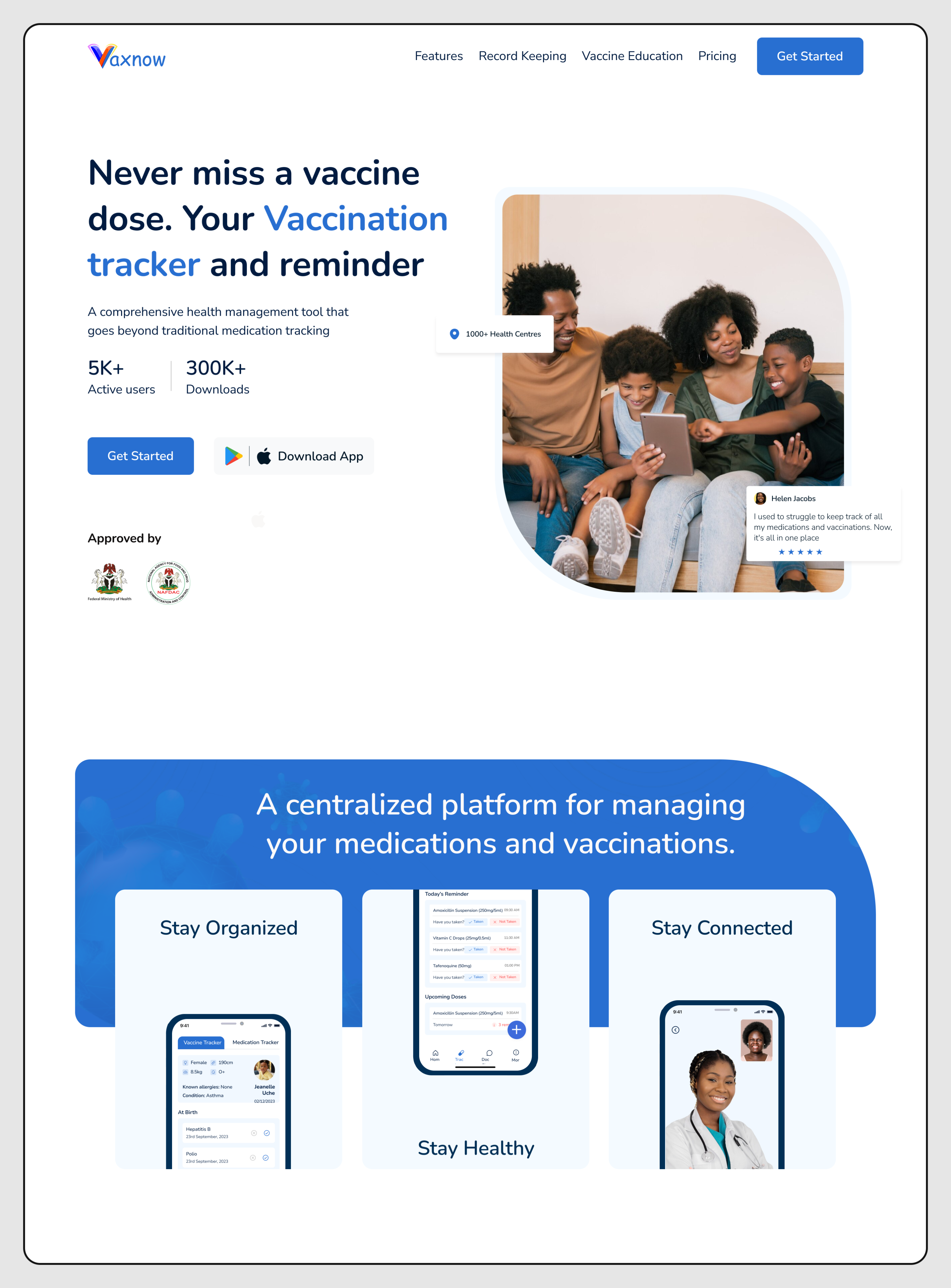
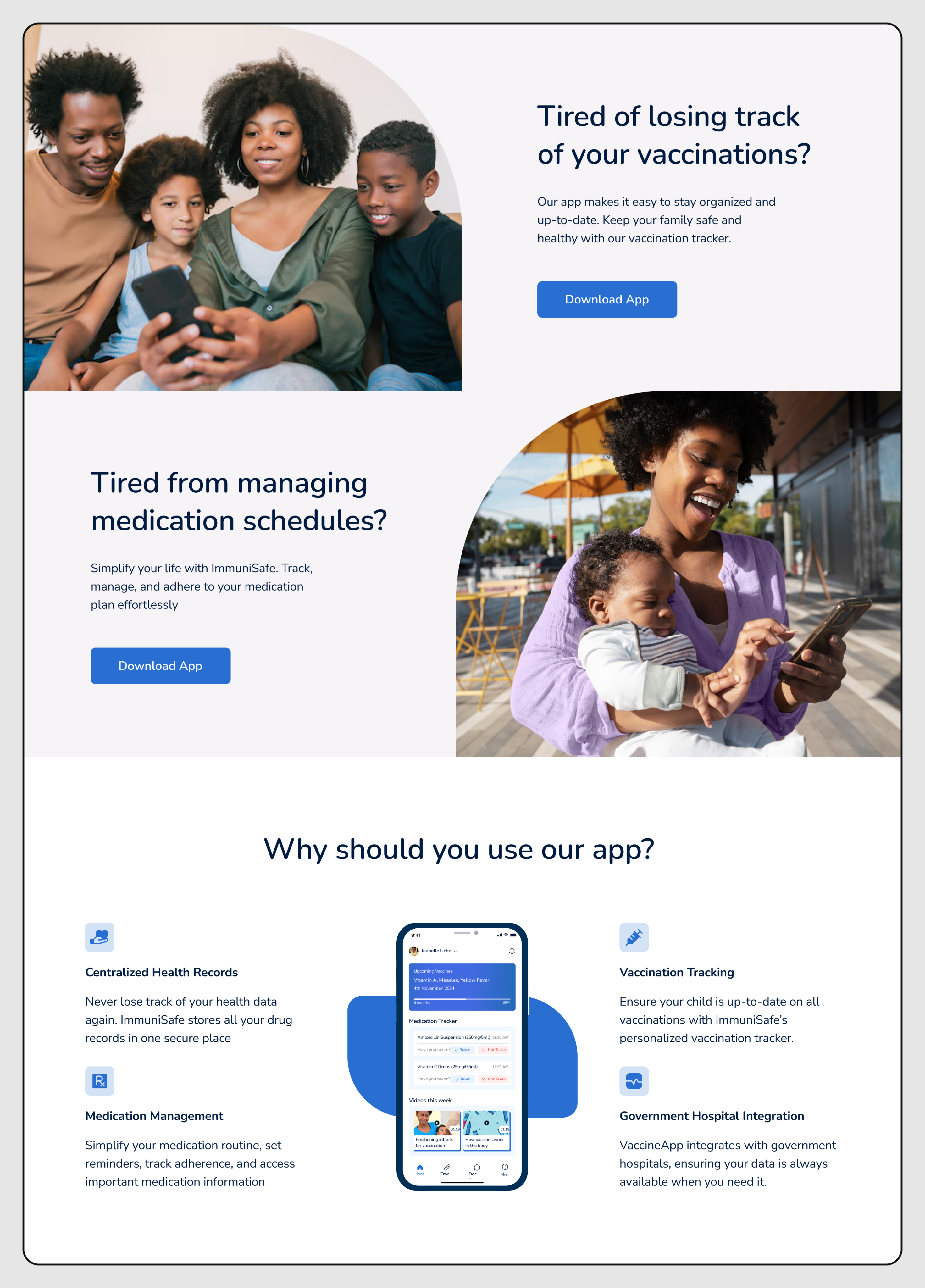
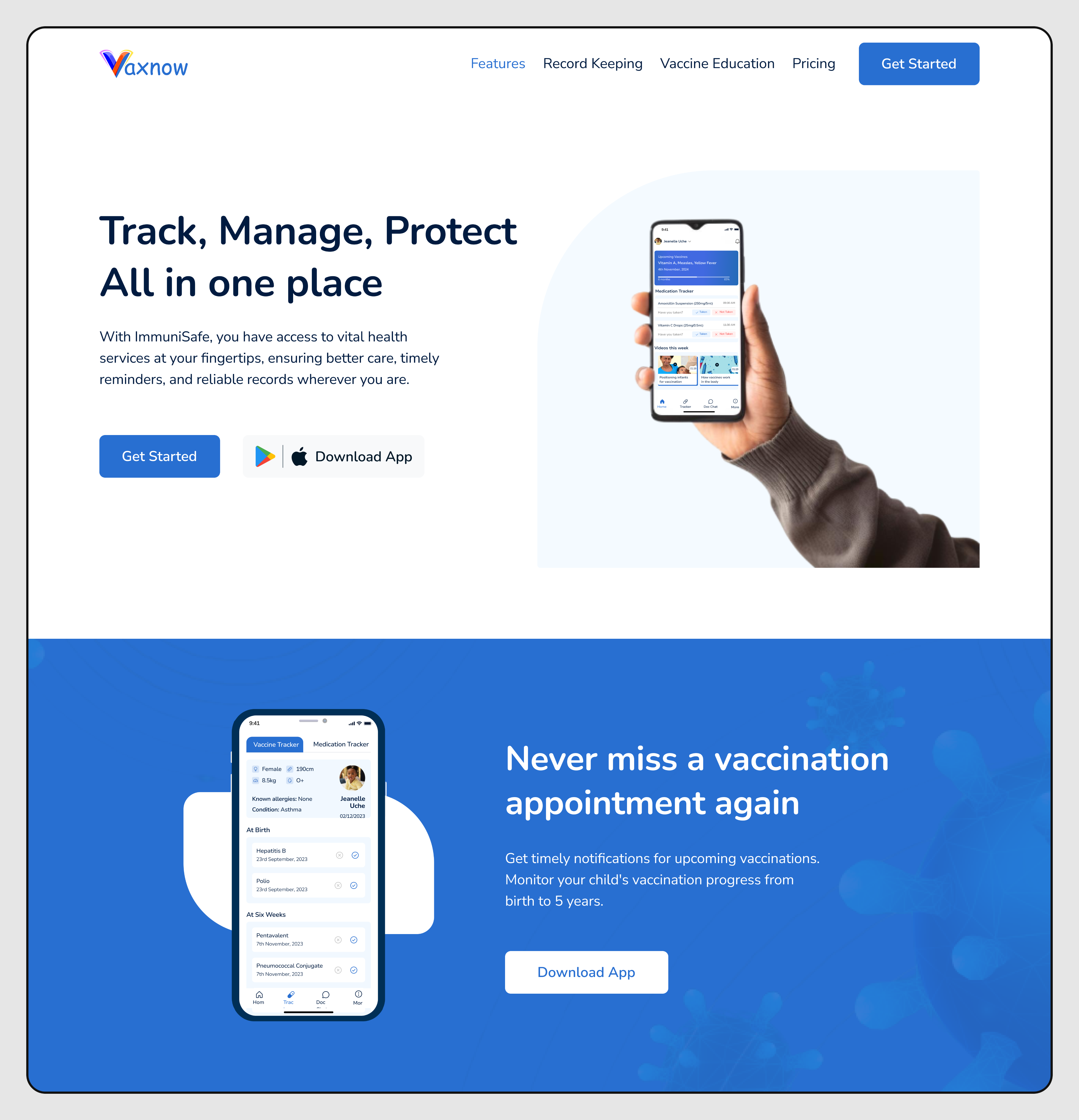
Vaccination Appointment Reminders: A section highlights the ability to "Never miss a vaccination appointment again." 
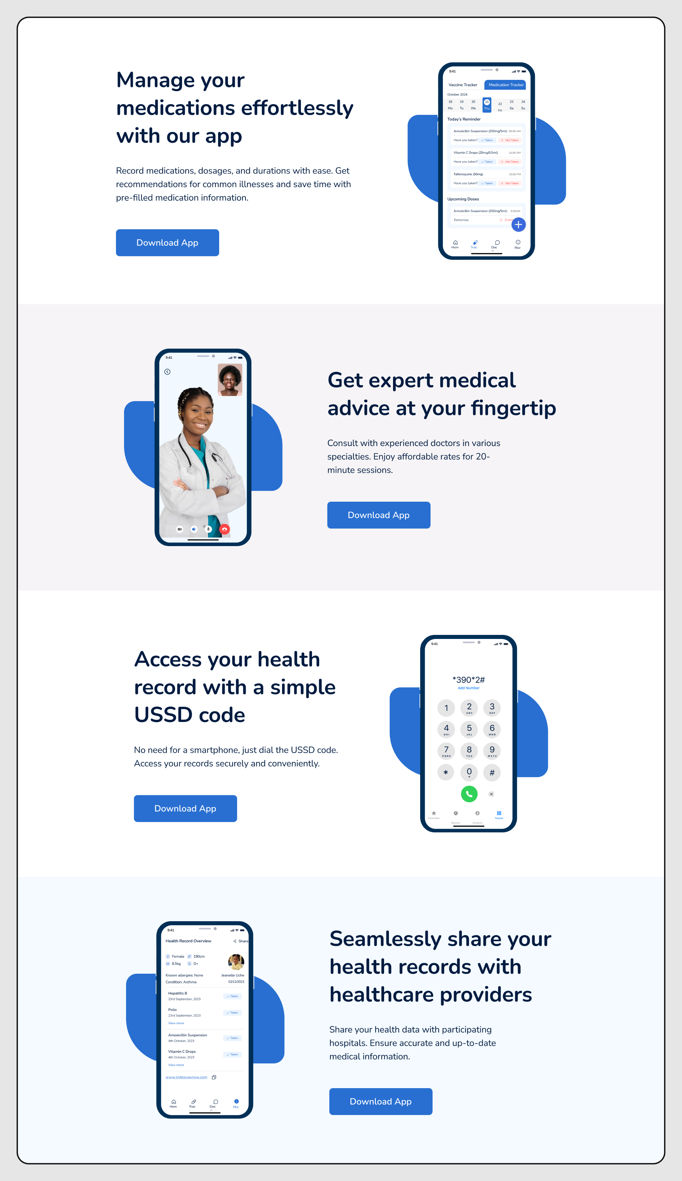
Medication Management: A feature is dedicated to helping users "Manage your medications effortlessly" with easy setup. Expert Medical Advice: The app offers a mechanism to "Get expert medical advice at your fingertips," likely via chat or consultation. Secure Record Sharing: Users can "Securely share your health records with healthcare providers." 
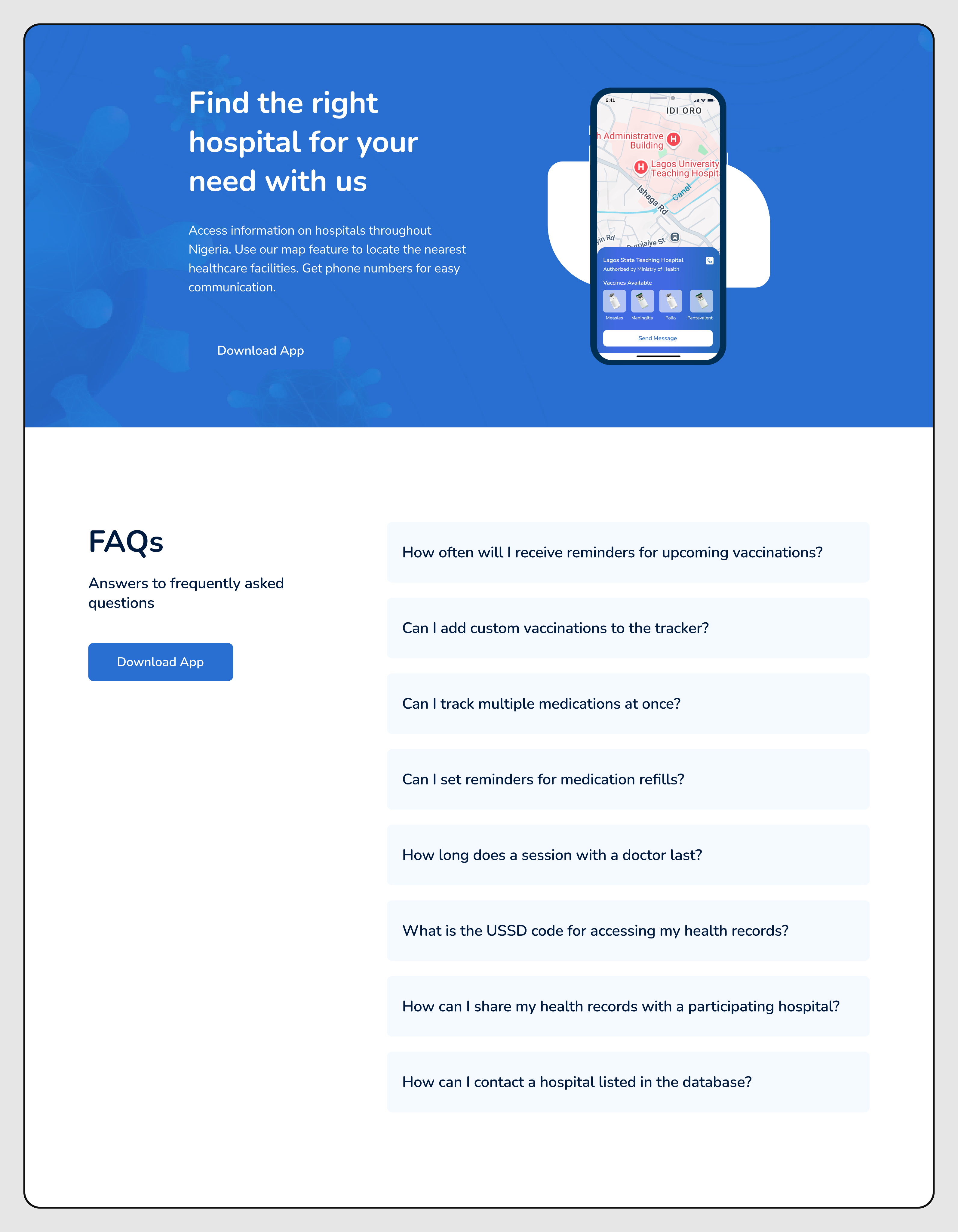
Location-Based Services: A map-like graphic suggests a feature to "Find the right clinic near you." FAQ: A dedicated section addresses common user questions about the product.


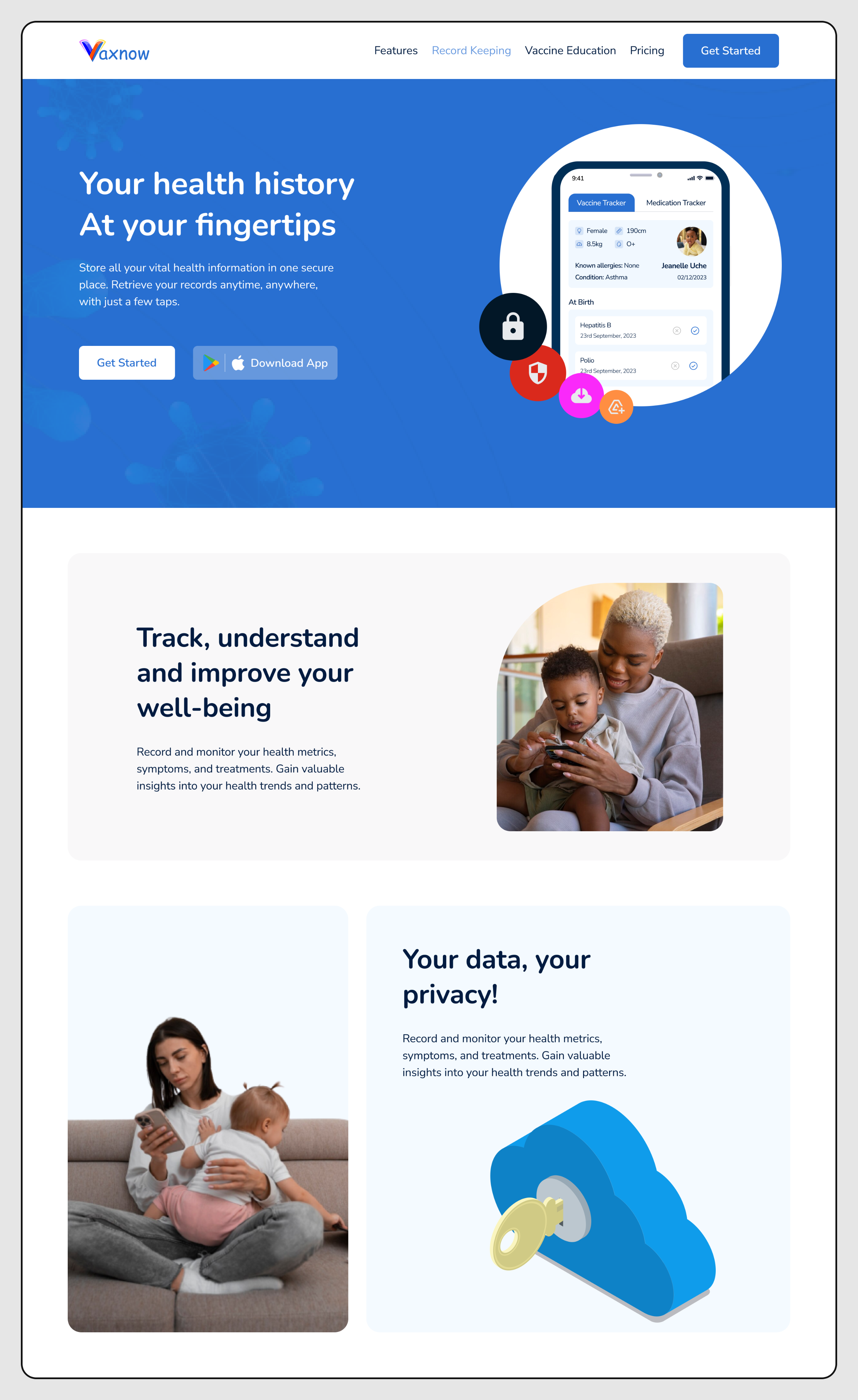
Data Security: A section prominently assures users about data privacy and security with a large visual metaphor of a key/lock. 
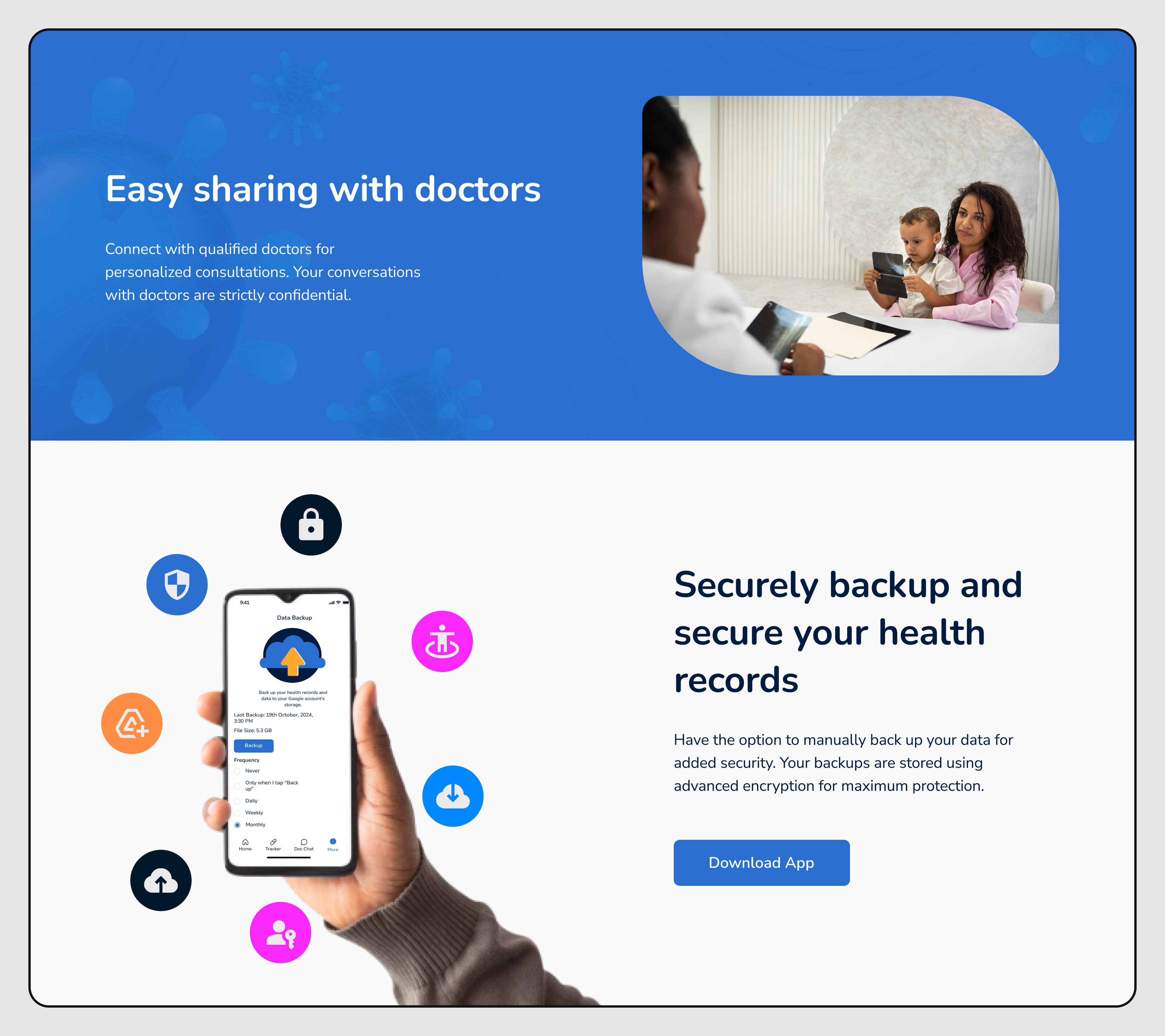
Easy Data Sharing: A dedicated section highlights the simplicity of sharing health data with doctors. Secure Backup: The platform offers a service to securely backup and restore health records.


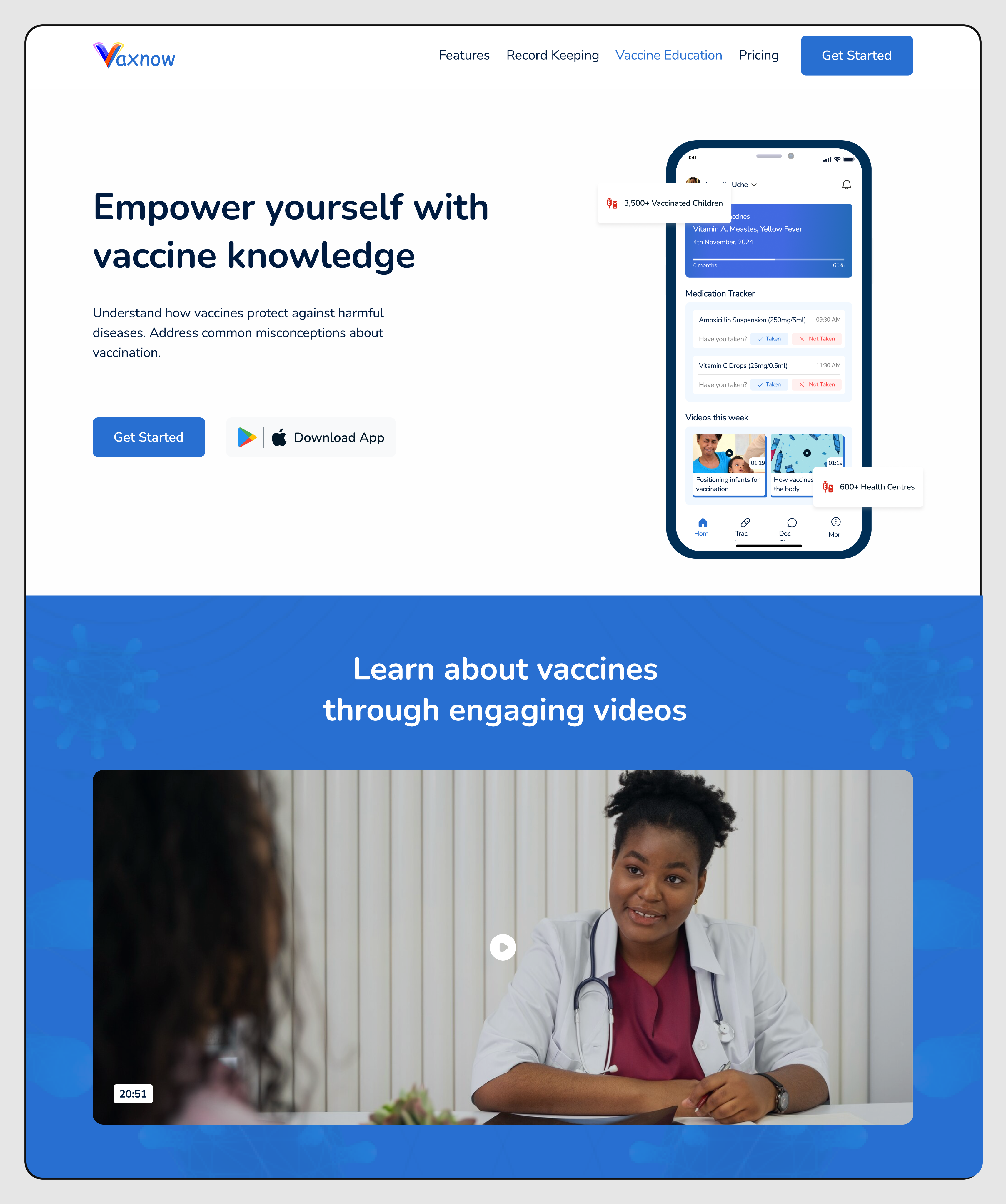
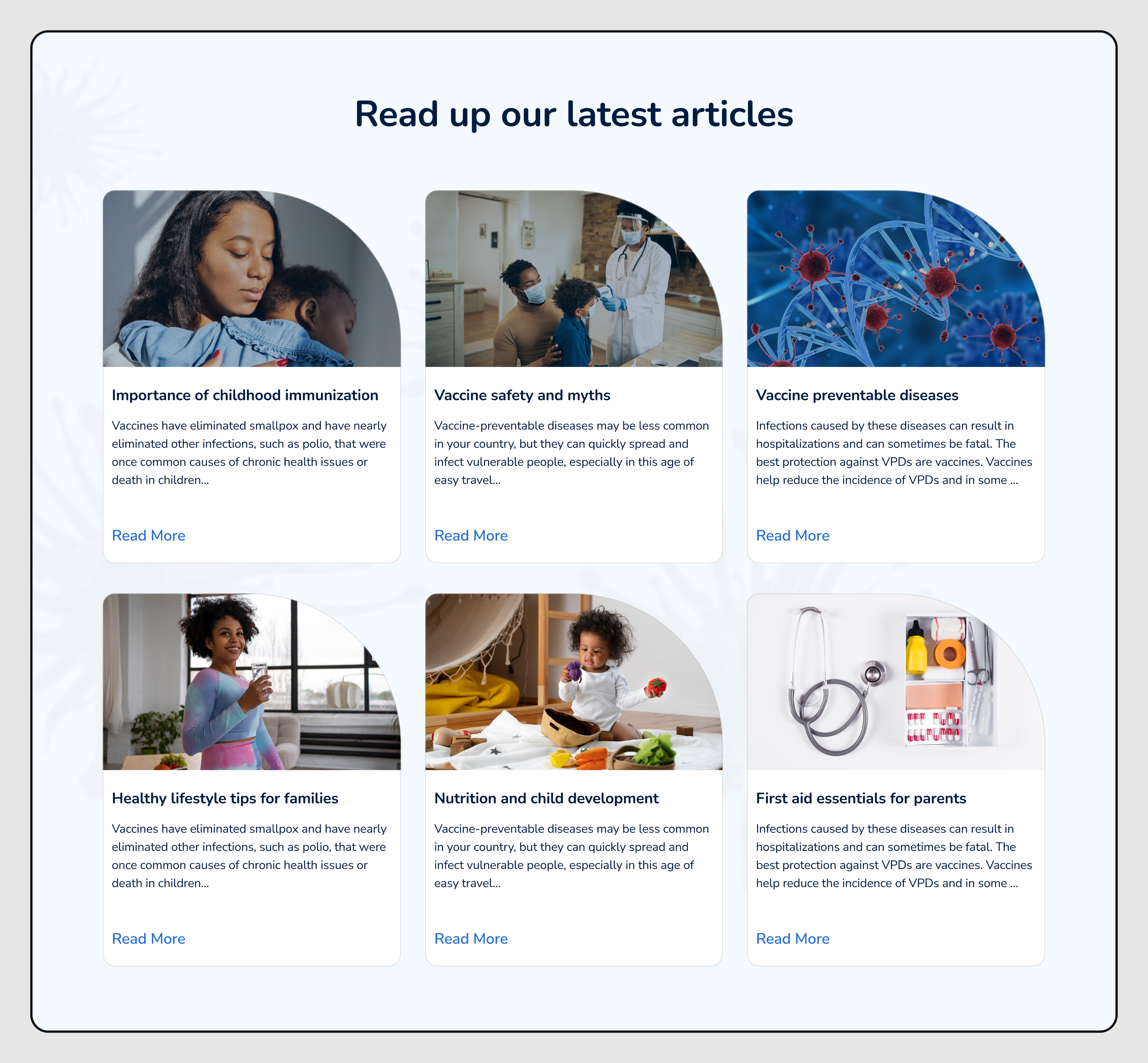
Video-Based Learning: A large section is dedicated to learning about vaccines "through engaging videos." Search Input: Users can search using any NGX stock or index fund ticker symbol (e.g., DANGCEM, GTCO, MTNN). Premium Subscription: A clear call-to-action ("Upgrade") promotes KBS Invest Premium for advanced projections and unlimited AI queries. Suggested Tickers: Quick-access buttons are provided for frequently searched or popular NGX stocks (e.g., DANGCEM, AIRTELAFRI, BUACEMENT).

To validate the clarity and usability of the VaxNow website, I conducted a small round of usability testing with five mothers. Each participant represented our primary audience group, making their feedback particularly valuable for refining the site.The test sessions focused on two core tasks. Navigating the website to locate the vaccine tracker information, and finding details about nearby hospitals. These tasks helped evaluate how intuitive the site structure was and whether users could quickly access high value features without guidance.Overall, the results were encouraging. Eighty percent of participants reported that the website was easy to navigate and that the flow between sections felt natural. However, forty percent expressed discomfort with the brightness of the red colour used in certain areas. This feedback highlighted the need to soften the visual tone to make the experience more welcoming and less intense for users.Based on these insights, I made two key adjustments. Firstly, I refined the colour palette to incorporate softer and more calming tones. Secondly, I introduced a sticky navigation bar to improve movement across sections, especially for users browsing on mobile devices. These refinements improved the clarity, and overall user experience of the website.
The redesigned website communicates the VaxNow value proposition with clarity and credibility, resulting in stronger user engagement and increased intent to download the app. The structured storytelling improved parent understanding of key features, and the accessibility improvements broadened the platform’s reach across different device types.By presenting VaxNow as a trustworthy medical companion rather than just another app, the website supports long term brand positioning. It empowers parents to make informed decisions, encourages hospital collaborations, and aids the team in pitching to government agencies and health organizations. The website now serves as an essential gateway into the VaxNow ecosystem.
edidiongkalu@gmail.com
Project Idea
Project Direction